Coronavirus - Data Analysis Thread
Discussion


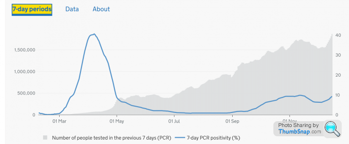
The Government data dashboard now includes 7 day PCR positivity rates which presumably ameliorates the 'more testing, more cases' effect. Only works at nation level currently - this is for England:
https://coronavirus.data.gov.uk/details/testing?ar...
https://coronavirus.data.gov.uk/details/testing?ar...
Elysium said:
Well spotted. This is essentially the same curve as my 'cases per 100k tests' graph.
Unfortunately its only for England at the moment.
The 'About' also explains how it attempts to de-dup multiple tests and/or positives for the same person, I wonder if there is a different level of de-dup in the raw cases/positives numbers?Unfortunately its only for England at the moment.
steveT350C said:
Good call
eta:
Quoting Spruce Goose from the cure thread,
“ Heart disease, cancer, etc. Deaths are surprisingly down this year. Cv19 deaths are up, people that die at home are up.
The average age of cv19 deaths is 82, 1 year younger than normal average death age.
Hospitals are overwhelmed, but surprisingly no different to last 20 years.”
Having the above’s data, and indeed all relevant data, packaged and presented in an easily shared and understood format has to be done.
I’ll build a PowerPoint presentation based on what gets posted here.
It is frustrating albeit not surprising that simple facts and figures re so hard to find re Covid. If only either the Govt or the media (perish the thought) just presented all the adults with facts then let us risk assess for ourselves eta:
Quoting Spruce Goose from the cure thread,
“ Heart disease, cancer, etc. Deaths are surprisingly down this year. Cv19 deaths are up, people that die at home are up.
The average age of cv19 deaths is 82, 1 year younger than normal average death age.
Hospitals are overwhelmed, but surprisingly no different to last 20 years.”
Having the above’s data, and indeed all relevant data, packaged and presented in an easily shared and understood format has to be done.
I’ll build a PowerPoint presentation based on what gets posted here.
Edited by steveT350C on Sunday 20th December 15:01

TX.
bigandclever said:
steveT350C said:
Quoting Spruce Goose from the cure thread,
The average age of cv19 deaths is 82, 1 year younger than normal average death age.
I know we said ‘no arguments’, but the average Covid death age is 82.4; the average non-Covid death age is 81.5.The average age of cv19 deaths is 82, 1 year younger than normal average death age.
So average covid-death age is older, not younger.
This chap does some excellent work with the data and adds some observations / questions too.
https://twitter.com/RealJoelSmalley
A few of his recent charts copied below.


https://twitter.com/RealJoelSmalley
A few of his recent charts copied below.
Otispunkmeyer said:
Has anyone seen any US thanks giving data? Just seen anecdotes about how the prognosis was more more more death and despair if people meet up for Thanksgiving. But they did and the data suggests otherwise...
US and EU27 fatalities per million from the datagraver website: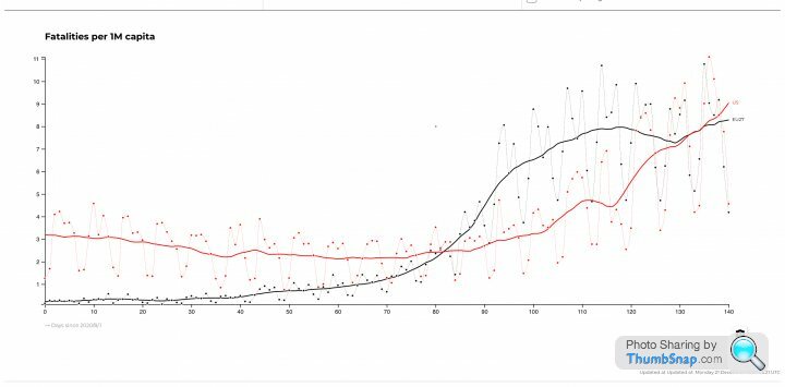
bigandclever said:
coanda said:
bigandclever said:
That’s not data, it’s a terrible, unintelligible chart.
Let's see your attempt at answering Otis' question then.eg


The graphs made and posted by some of the members, in particular Elysium have been great. However all the information used is readily available to the public, even the BBC have produced graphs which show the "real picture."
It just seems that Joe public doesn't much care to look into these things for themselves and only take in the doom mongering graphs presented by Whitty and Valance.
Anyway keep up the good work guys.
It just seems that Joe public doesn't much care to look into these things for themselves and only take in the doom mongering graphs presented by Whitty and Valance.
Anyway keep up the good work guys.
Gassing Station | News, Politics & Economics | Top of Page | What's New | My Stuff