Coronavirus - Data Analysis Thread
Discussion


Elysium said:
Thanks. I think that answers the question. There was a dip right after (or they were already in a downward trajectory) but it has risen again in the proceeding week. What is the general idea? 7 days to full blown symptoms and about 14 for the deaths?Perhaps some was pre-baked, but I think I would err on the side of those anecdotes not being correct.
When comparing countries Sweden and UK normally come up because the timing of their epidemic curves is similar and they have different lockdown policies. People also argue that Sweden should be compared to neighbouring states.
This is from Euromomo, where you can choose countries to compare z-scores and zoom in on a particular timescale. In this case all of 2020:
https://www.euromomo.eu/graphs-and-maps/#
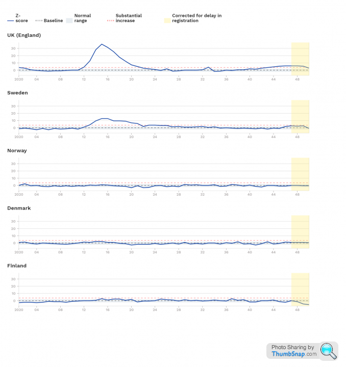
UK lockdown was wk 13, so if we assume 3 weeks from infection to death the impacts should be seen wk 16.
This comparison between Sweden and neighbouring states suggests they faced difficult levels of infection between wks 13 and 16.
This is from Euromomo, where you can choose countries to compare z-scores and zoom in on a particular timescale. In this case all of 2020:
https://www.euromomo.eu/graphs-and-maps/#
UK lockdown was wk 13, so if we assume 3 weeks from infection to death the impacts should be seen wk 16.
This comparison between Sweden and neighbouring states suggests they faced difficult levels of infection between wks 13 and 16.
ONS data published today:
https://www.ons.gov.uk/peoplepopulationandcommunit...
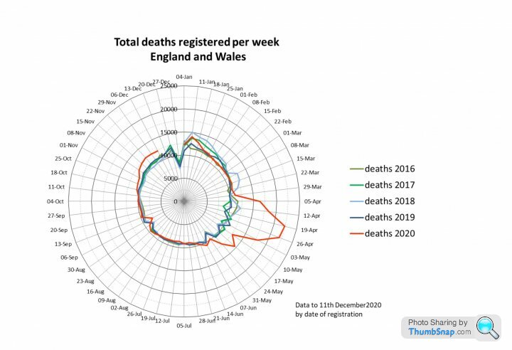
This shows ONS all cause deaths with those 'due to' COVID highlighted in orange. The dotted lines are the average, max and min for 2015-2019 adjusted for the 2019 population. The solid green line is the limit of statistical significance or 2 x standard deviations from the average.
I think it is interesting that we had sigificant non-COVID excess death in the spring, but non-COVID deaths are now below the 5 year minimum. This requires further explanation.
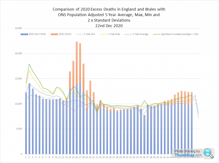
This second graph uses the same data set, to show 'due to COVID' deaths and excess deaths. I think this gives a good idea of the relative scale of the spring and autumn outbreaks:
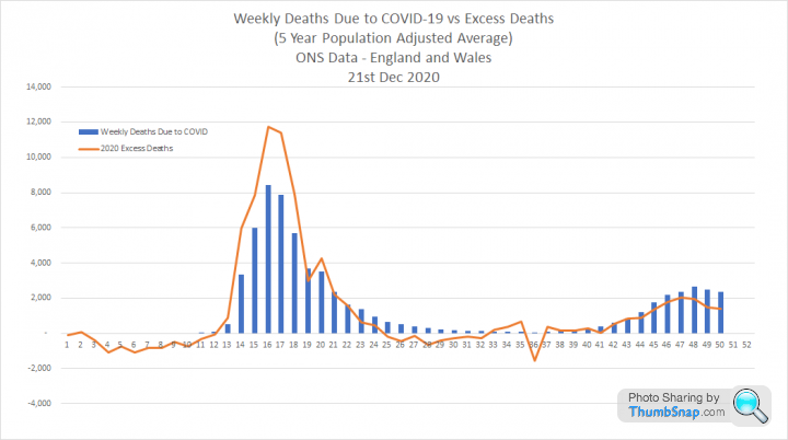
https://www.ons.gov.uk/peoplepopulationandcommunit...
This shows ONS all cause deaths with those 'due to' COVID highlighted in orange. The dotted lines are the average, max and min for 2015-2019 adjusted for the 2019 population. The solid green line is the limit of statistical significance or 2 x standard deviations from the average.
I think it is interesting that we had sigificant non-COVID excess death in the spring, but non-COVID deaths are now below the 5 year minimum. This requires further explanation.
This second graph uses the same data set, to show 'due to COVID' deaths and excess deaths. I think this gives a good idea of the relative scale of the spring and autumn outbreaks:
Otispunkmeyer said:
Elysium said:
This graph shows the 7 day average of cases for London and Wales. I have identified the time periods where the Welsh Firebreak and English Lockdown could have had an impact on transmission.
Data here: https://coronavirus.data.gov.uk/details/cases
Both show a dip during tighter restrictions with a rapid rebound. London has rebounded harder, but was growing faster prior to restrictions. The dip at the end is reporting lag:

Like I replied in the other thread. Looks like lockdown does have an effect. It is just short lived and doesn't effect the eventual outcome given what looks like a quick "reversion to the mean" once the restrictions stop.Data here: https://coronavirus.data.gov.uk/details/cases
Both show a dip during tighter restrictions with a rapid rebound. London has rebounded harder, but was growing faster prior to restrictions. The dip at the end is reporting lag:
Edited by Elysium on Sunday 20th December 15:28
So perhaps there is a use for them. But the expectations should be that it's not going to make the virus go away. It will come straight back again the moment you emerge. Obviously we cannot lockdown ad infinitum, but perhaps they can be used to buy some time for the services.
But then we are not seeing anything like as bad as it was in spring, so are they actually being genuinely useful?
ETA - or more specifically, the % of positive tests results. Would be interested to see how they are linked.
Edited by survivalist on Tuesday 22 December 12:20
survivalist said:
Otispunkmeyer said:
Elysium said:
This graph shows the 7 day average of cases for London and Wales. I have identified the time periods where the Welsh Firebreak and English Lockdown could have had an impact on transmission.
Data here: https://coronavirus.data.gov.uk/details/cases
Both show a dip during tighter restrictions with a rapid rebound. London has rebounded harder, but was growing faster prior to restrictions. The dip at the end is reporting lag:
Like I replied in the other thread. Looks like lockdown does have an effect. It is just short lived and doesn't effect the eventual outcome given what looks like a quick "reversion to the mean" once the restrictions stop.Data here: https://coronavirus.data.gov.uk/details/cases
Both show a dip during tighter restrictions with a rapid rebound. London has rebounded harder, but was growing faster prior to restrictions. The dip at the end is reporting lag:
Edited by Elysium on Sunday 20th December 15:28
So perhaps there is a use for them. But the expectations should be that it's not going to make the virus go away. It will come straight back again the moment you emerge. Obviously we cannot lockdown ad infinitum, but perhaps they can be used to buy some time for the services.
But then we are not seeing anything like as bad as it was in spring, so are they actually being genuinely useful?
Elysium said:
survivalist said:
Otispunkmeyer said:
Elysium said:
This graph shows the 7 day average of cases for London and Wales. I have identified the time periods where the Welsh Firebreak and English Lockdown could have had an impact on transmission.
Data here: https://coronavirus.data.gov.uk/details/cases
Both show a dip during tighter restrictions with a rapid rebound. London has rebounded harder, but was growing faster prior to restrictions. The dip at the end is reporting lag:
Like I replied in the other thread. Looks like lockdown does have an effect. It is just short lived and doesn't effect the eventual outcome given what looks like a quick "reversion to the mean" once the restrictions stop.Data here: https://coronavirus.data.gov.uk/details/cases
Both show a dip during tighter restrictions with a rapid rebound. London has rebounded harder, but was growing faster prior to restrictions. The dip at the end is reporting lag:
Edited by Elysium on Sunday 20th December 15:28
So perhaps there is a use for them. But the expectations should be that it's not going to make the virus go away. It will come straight back again the moment you emerge. Obviously we cannot lockdown ad infinitum, but perhaps they can be used to buy some time for the services.
But then we are not seeing anything like as bad as it was in spring, so are they actually being genuinely useful?
The next couple of weeks will be interesting. Assuming test capacity remains broadly flat, I’m curious to see if actual tests drop over the Christmas & New Year period as people focus on fun.
Guess the schools and universities being closed will also have an impact.
It’s effectively the ONS excess deaths data, but I think this is a great ‘Florence Nightingale’ graph shared by Carl Heneghan:
https://www.cebm.net/covid-19/covid-19-florence-ni...
https://www.cebm.net/covid-19/covid-19-florence-ni...
So far 
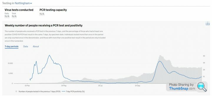
Just seen that the Gov staging site now provides positivity data at local authority level for England:
https://coronavirus.data.gov.uk/details/testing
Hastings, which is caught up in the 'Southern Surge' is hitting 15%
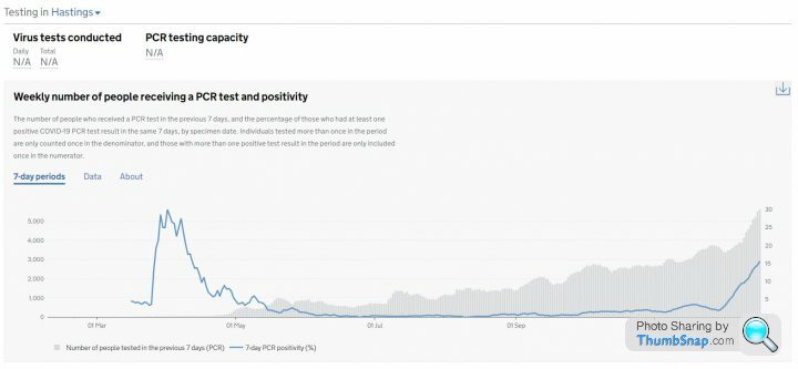
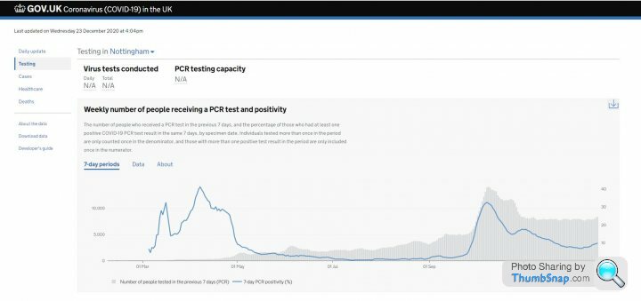
However, Liverpool and Nottingham were 19.9% and 32.5% respectively when they peaked:
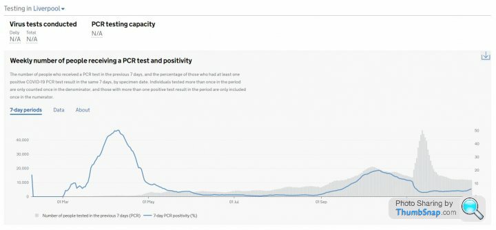
Interesting that positivity remained steady during Liverpools mass testing spike.
Just seen that the Gov staging site now provides positivity data at local authority level for England:
https://coronavirus.data.gov.uk/details/testing
Hastings, which is caught up in the 'Southern Surge' is hitting 15%
However, Liverpool and Nottingham were 19.9% and 32.5% respectively when they peaked:
Interesting that positivity remained steady during Liverpools mass testing spike.
NHS England have started publishing data on the number of vaccines administered by age group and first/second dose.
https://www.england.nhs.uk/statistics/statistical-...
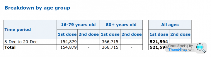
Data in this series will updated on a weekly basis, covering vaccinations in the Monday to Sunday of the week prior and revised historic data.
https://www.england.nhs.uk/statistics/statistical-...
Data in this series will updated on a weekly basis, covering vaccinations in the Monday to Sunday of the week prior and revised historic data.
Elysium said:
So far
Interesting that positivity remained steady during Liverpools mass testing spike.
Perhaps, I'm misunderstanding you. But this was one of the unexpected findings of the mass testing programme in Liverpool - it found surprisingly few additional cases.Interesting that positivity remained steady during Liverpools mass testing spike.
As your graph shows, as the mass testing program ramped up, the percentage of positive results plummeted - because the large increase in testing was not accompanied by a large increase in positive results. Before mass testing started, there were 13.7k tests per week, with a positivity rate of 11.4% (1560 new cases per week). At peak of mass testing a week later, there were 46.9k tests per week with a positivity rate of 3.2% (1500 cases per week).
One potential explanation which was raised locally was that there was poor engagement with mass testing (which was optional) by people in the highest risk population groups. To somewhat oversimplify, the more precautions people were taking (and therefore the less likely they were to contract it), the more likely they were to agree to testing.
WatchfulEye said:
Elysium said:
So far
Interesting that positivity remained steady during Liverpools mass testing spike.
Perhaps, I'm misunderstanding you. But this was one of the unexpected findings of the mass testing programme in Liverpool - it found surprisingly few additional cases.Interesting that positivity remained steady during Liverpools mass testing spike.
As your graph shows, as the mass testing program ramped up, the percentage of positive results plummeted - because the large increase in testing was not accompanied by a large increase in positive results. Before mass testing started, there were 13.7k tests per week, with a positivity rate of 11.4% (1560 new cases per week). At peak of mass testing a week later, there were 46.9k tests per week with a positivity rate of 3.2% (1500 cases per week).
One potential explanation which was raised locally was that there was poor engagement with mass testing (which was optional) by people in the highest risk population groups. To somewhat oversimplify, the more precautions people were taking (and therefore the less likely they were to contract it), the more likely they were to agree to testing.
Interesting that we see something similar in the latest data for Havering:
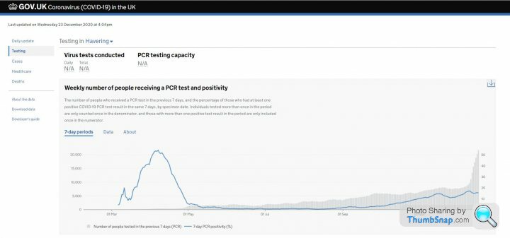
Edited by Elysium on Thursday 24th December 14:43
Gassing Station | News, Politics & Economics | Top of Page | What's New | My Stuff